tNPS Feedback Form
The first order of business was to improve the user experience of the NPS form so we could gather more user feedback. The form already existed in the app as a non-responsive web form displayed inside a web view. We knew we could improve the user experience by implementing the form natively on both phones and tablets.
Once the newly designed form was released:
- Total NPS volume increased 70x,
- iTunes feedback submission rate increased by 2,000%,
- NPS score increased by 38 points (to the low 50s),
- App Store rating increased 1.25 points to 4.75.
On the confirmation screen, promoters are encouraged to submit their rating to the app store.
I created a clickable prototype to assist in design communication with the European based development team. If you are viewing from a non-mobile device, you can navigate through the screens individually.

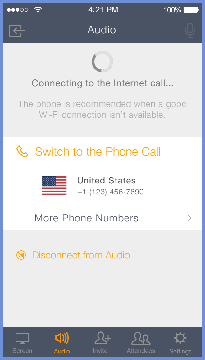
Audio Tab
Ideally, users enter a meeting and the audio works seamlessly; however, that is not always the case. Our users have expressed, and we've experienced as well using the app, that when the audio breaks down it degrades the quality of the session, sometimes irreversibly. We redesigned the experience so users could easily and quickly access their audio status and options.
We first identified opportunities for improvement in the current design:
- The audio options were located in the Settings tab. As such, they are pretty hidden from the user.
- There is no indication of current audio status. How can a user know if they've successfully connected to VoIP? Or if they are connecting to the phone call? Or if they aren't connected to audio at all and that's why no one can hear them?
- Users had to deal with a lot of cognitive load. In order for a user to dial into the meeting, they had to remember the minimum 10-digit phone number, the 9-digit meeting ID and the 2-3 digit audio PIN when dialing into the meeting.
Armed with this information, we made the following changes:
- Promoted the audio information to its own permanent place on the tab bar
- Constantly displayed the current audio status, along with options to connect to another audio method and disconnect from audio entirely, in the newly minted Audio tab.
- Implemented a one-tap dial into session, a significant engineering effort, where users can tap on the button and the app will automatically dial the phone number, meeting ID and audio PIN.


Mic Permissions
We noticed a large number of NPS feedback with a common theme: users were able to hear others in the meeting, but those folks could not hear them. Our team hypothesized these users had not granted the app the mic permissions it needs to connect via VoIP. Taking a page from Cluster's experimentation, we evoked the dialog at the most opportune time while adding instructions on how to grant permission later on. After its release, that type of user feedback reduced dramatically, and this same model of permission request was used for other permissions in GoToMeeting, as well as other Citrix offerings including GoToWebinar, GoToTraining and OpenVoice.


No Connection Messaging
Mobile users are vulnerable to Internet signal fluctuations that can interfere with the quality of their meeting experience. To combat that, we designed a message users see when they are disconnected from the Internet for 5 seconds or more (this minimum length prevented fluttering in case of split second drop-offs and reconnects) with instructions to dial into the session.


Design Stencil
I created a design stencil to maintain consistency for myself or anyone else working on this project.
After every fourth session, users can choose to leave a rating and feedback or tap on Skip to return to GoToMeeting.